
Building MCP Tools with Rich UIs
How to build MCP tools with rich UIs using the right widget, data mapping, and action design, plus the compatibility caveats most guides skip.
MCP tools do not have to stop at plain text, but rich UI is not automatic either. The tool layer gives the model structured actions and data; the host decides how much interface it can render. In ChatGPT, OpenAI documents a portable iframe-and-bridge model for MCP Apps UIs. In drio, that translates into choosing the right widget, mapping API fields cleanly, and testing the result in the client you actually plan to ship.
If you only need a short factual answer, plain text is still fine. Reach for a richer UI when the user needs to compare options, submit structured input, review metrics, or trigger a next action without leaving the conversation.
First, separate the protocol from the presentation
This is where many guides get sloppy.
The official MCP server concepts docs define three server building blocks:
- tools for model-invoked actions
- resources for read-only context
- prompts for reusable user-invoked templates
That is the protocol layer.
Rich UI is a host behavior layered on top of that. OpenAI's current ChatGPT docs say ChatGPT supports the MCP Apps open standard for embedded app UIs, where the interface runs in an iframe and communicates over a standard bridge. The important implication is simple: not every MCP host will render the same UI in the same way.
So the right mental model is:
- MCP gives you the connection and capability layer
- the host determines the UI surface it can render
- your tool design should match the host you actually care about first
If you want the protocol background, start with What Is MCP?.
When plain text is enough and when it is not
Plain text is still a good default when the user only needs one answer.
| If the user needs to... | Start with... | Why |
|---|---|---|
| get a single factual answer | plain text or markdown | the UI overhead is unnecessary |
| compare records side by side | data table | structure matters more than prose |
| review a trend or performance snapshot | charts or stat cards | visual summaries are faster to scan |
| provide structured details | form | you need clean inputs, not a vague reply |
| browse options visually | product cards or a carousel | images, price, and actions beat paragraphs |
Here is the plain-text version of a simple answer:
Weather in Berlin:
- Temperature: 18 C
- Conditions: Partly cloudy
- Wind: 12 km/h NW
That works.
But if the user needs to compare hourly changes, choose a day, or act on the result, a richer surface becomes more useful than a paragraph. That is the same "show" value OpenAI calls out in What makes a great ChatGPT app: sometimes the best improvement is not more reasoning, but a clearer interface.
The five widget patterns that cover most tools
drio currently ships with more than 20 widget primitives, including data tables, charts, stat cards, maps, forms, markdown views, product cards, carousels, order flows, and more. In practice, five patterns cover most real use cases.
Data Table
Use a data table when the user needs comparison.
This is the right choice for:
- lists of records
- search results
- operational logs
- report rows
- inventory or catalog views
Good data-table tools usually have a predictable collection shape and stable fields. If the answer is "here are 15 records, now help me compare them," a table is the cleanest starting point.
A sales assistant showing open deals, or a support assistant listing recent tickets, should almost always start here instead of falling back to markdown.
Form
Use a form when the conversation needs clean input before the next tool call.
This is a strong fit for:
- issue submission
- quote requests
- booking flows
- qualification and intake
- support lookups
In drio's widget runtime, forms can include hidden fields, mapped prefills, and multiple submit modes. The current form config supports callTool, postMcp, and followUpMessage, which makes forms useful for real multi-step flows instead of static lead-capture surfaces.
If the next useful step is "give me your order number and email," a form beats three clarifying turns every time.
Stat Cards
Use stat cards when the user needs a quick scan of a few headline metrics before drilling deeper.
Think:
- campaign summaries
- account overviews
- support queue health
- revenue snapshots
- KPI checks
Stat cards are strongest when the reader wants orientation first and detail second.
Think of the first panel in a campaign review: spend, pipeline, CAC, and win rate. That is stat-card territory.
Charts
Use charts when the important question is about direction, distribution, or proportion.
drio's current primitives include bar, line, and pie charts. These are a better fit than tables when the point is trend recognition, not row-by-row inspection.
If someone asks "what changed this week?", a chart usually answers faster than a paragraph.
Product Cards and Carousels
Use cards and carousels when the answer is visual and choice-heavy.
This pattern works well for:
- product search
- recommendations
- menu browsing
- travel or listing results
- any flow where images and quick actions matter
If the user is deciding among options, cards are often the fastest route to clarity.
Product search, restaurant picks, travel listings, and real-estate style results all fit this pattern well.
A widget config that stays close to the real runtime
The exact authoring flow is visual in drio, but it helps to see the shape of the runtime config.
Here is a data-table widget config that stays close to the actual WidgetConfig and DataTableConfig types in the widget package:
const widgetConfig = {
  primitiveId: "data-table",
  dataTableConfig: {
    version: "v1",
    collectionPath: "results",
    fields: [
      { key: "name", path: "name", label: "Name" },
      { key: "price", path: "price", label: "Price" },
      { key: "status", path: "status", label: "Status" },
    ],
  },
};
And here is the same idea for a form:
const formConfig = {
  version: "v2",
  fields: [
    {
      id: "order-id",
      key: "orderId",
      label: "Order ID",
      type: "text",
      required: true,
    },
    {
      id: "source",
      key: "source",
      label: "Source",
      type: "text",
      visibility: "hidden",
      prefill: { kind: "static", value: "support-widget" },
    },
  ],
  layout: {
    submitLabel: "Check order",
    sections: [{ id: "main", fieldIds: ["order-id", "source"] }],
  },
  submit: {
    mode: "callTool",
    targetToolName: "lookupOrder",
    bindings: [
      { fieldId: "order-id", targetArgPath: "orderId", status: "mapped" },
      { fieldId: "source", targetArgPath: "source", status: "mapped" },
    ],
  },
};
You do not need to write that by hand in drio, but understanding the shape helps you design better responses. Each widget should have a clean data contract, not a pile of ad hoc fields.
Keep the tool contract clean
Rich UI gets messy when the server sends one giant payload and hopes the widget sorts it out later.
OpenAI's current MCP server guide keeps the split explicit:
structuredContentis the concise shape the model can readcontentis optional narration_metais widget-only data the model does not need
A clean response shape looks like this:
return {
  structuredContent: {
    orders: [{ id: "ord_123", status: "delayed", eta: "2026-05-14" }],
  },
  content: [
    {
      type: "text",
      text: "Showing the delayed order and its next step.",
    },
  ],
  _meta: {
    ordersById: {
      ord_123: {
        customerName: "Jane Doe",
        returnEligible: true,
      },
    },
  },
};
That split matters because the model needs the summary, not your whole backend payload. The widget can keep richer drill-down data without making tool selection noisier or the tool result harder to reason about.
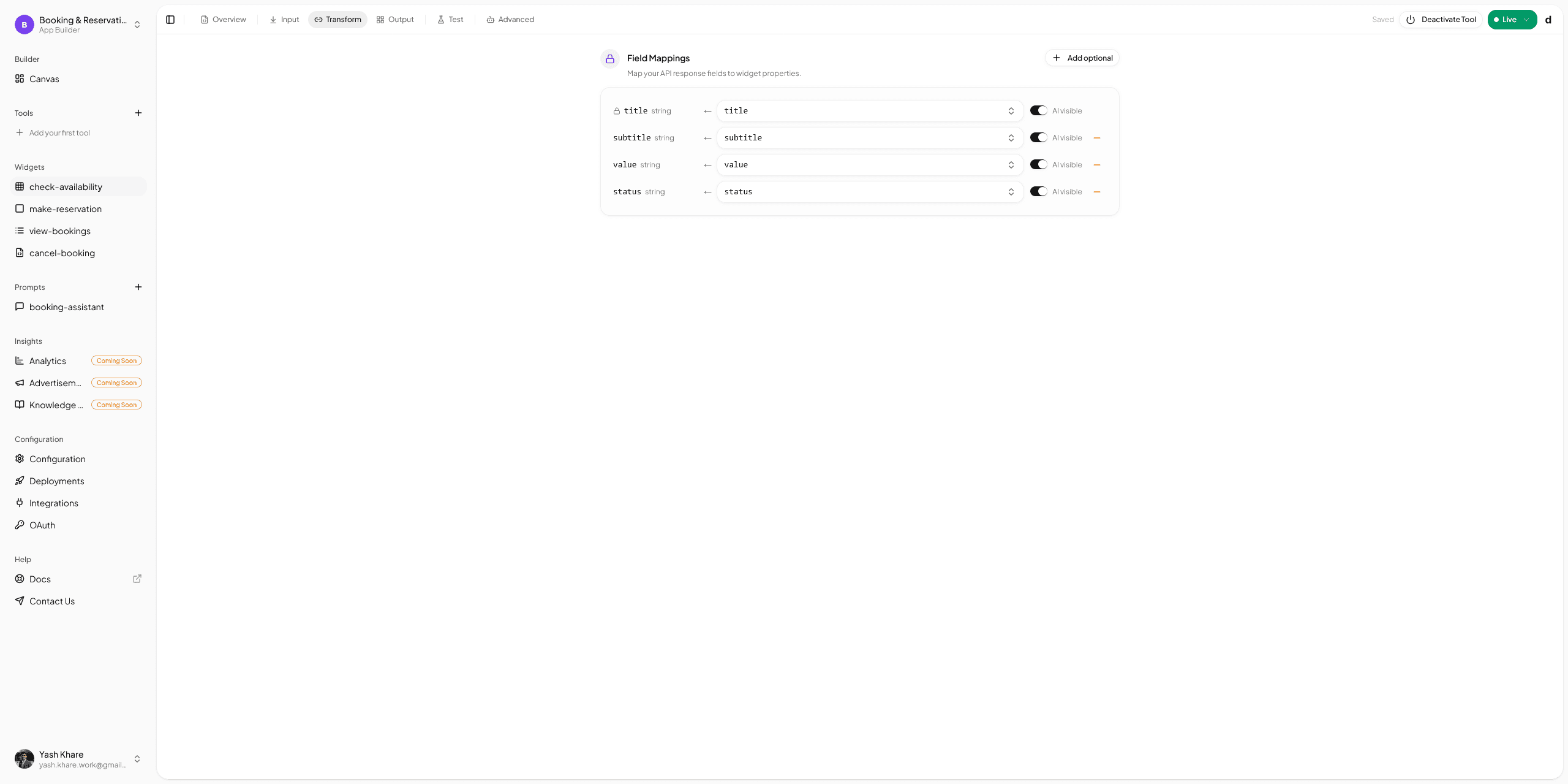
How mapping works in drio
The visual workflow is the bridge between raw API data and a usable in-chat interface.
The normal path looks like this:
- call an API or other upstream source
- inspect the response shape
- choose the widget that matches the natural shape of the data
- map response fields to visible widget properties
- preview the output before publishing
That is exactly why Choose The Right Response Format matters. The best widget is usually the one that matches the data with the least force-fitting.
If you want the practical API side of that workflow, follow Connecting Your First API.
Split data tools from render tools when the UI is heavy
One of the more useful current OpenAI UI recommendations is the decoupled pattern: let one tool fetch or compute data, and let a second tool own the widget template.
The reason is practical. If every tool call mounts a widget, the iframe can rerender too often, and the model gets less room to refine the answer before it decides to show UI.
A clean two-step flow looks like this:
search_productsreturnsstructuredContentwith IDs, names, prices, and filters.- The model narrows or chains off that data.
render_product_resultsattaches the UI template with_meta.ui.resourceUri.- The widget handles local actions like pagination or selection without remounting the whole flow.
This pattern is especially useful for:
- search tools that often lead to follow-up filtering
- dashboards where the first call gathers data and the second call decides what matters
- tables, maps, and media-heavy widgets that are expensive to rerender
OpenAI's current ChatGPT UI guide explicitly recommends this data-tool/render-tool split for heavier interfaces. If you are building in drio, the practical lesson is simple: keep business logic in the tool layer and keep the render tool focused on presentation.
Display modes and actions shape the experience too
A rich UI is not just the visible widget.
The current drio runtime and widget types also support:
- display modes such as
inline,pip, andfullscreen - widget actions such as
followUpMessage,callTool,openExternal, andopenModal
Those choices matter.
Use inline when the widget is part of the natural answer flow. Use a larger surface when the user is doing something more dashboard-like. Use follow-up actions when the widget should move the conversation forward, not just sit there as decoration.
This is also why forms are more than a styled input box. In the current runtime, a form can send a follow-up message, call another tool directly, or post to an MCP target. That makes it useful for real multi-step workflows.
What most teams get wrong
They pick the widget before they look at the data
If the API returns flat records, do not force them into a card layout. If the answer is visual comparison, do not default to markdown.
They try to make one tool do everything
A tool that returns a giant dashboard, a form, a long explanation, and three separate actions is usually doing too much. Keep the unit of interaction clear.
They attach a widget to every tool call
Not every fetch needs an iframe. If the model still needs to refine, compare, or chain the result, let it do that before the render step.
They forget the empty and error states
The perfect demo response is not the normal response. Test zero-result cases, partial data, and missing fields.
They assume every host renders the same UI
This is the most important caveat. ChatGPT now documents a portable MCP Apps UI model, but host support still varies. Always test the client you plan to launch first.
If you want the fastest practical path
Start with Connecting Your First API, then pair it with Choose The Right Response Format. That combination will get you further than jumping straight into flashy UI decisions.
Build the smallest interactive flow first
The best first rich-UI tool is usually not a giant dashboard. It is one focused tool that does one thing clearly:
- one table with useful actions
- one form that triggers a next step
- one chart that explains a trend
- one card-based result set that makes selection easy
If you are still deciding whether the builder route fits your team, read Build AI Apps Without Code.
Summary
Building MCP tools with rich UIs is less about "making it prettier" and more about matching the interface to the user's next decision. The protocol gives you tools, resources, and prompts. The host gives you the UI surface it supports. Your job is to choose the smallest interface that makes the answer clearer and easier to act on.
In drio, that means picking the right widget, mapping data cleanly, using actions intentionally, and testing in the target client. Start simple, design around the data shape, and let richer UI earn its place.
FAQ
Can MCP tools render interactive UI?
Yes, in hosts that support it. MCP gives you the capability layer, while host-specific or shared app UI standards determine how rich interfaces are rendered. ChatGPT now documents MCP Apps-compatible embedded UIs, but support still varies by client.
Which widget should I start with?
Start with the simplest widget that matches the user's next decision. Use a table for comparison, a form for structured input, cards for browsing, and charts or stat cards for quick numeric scans.
Can a widget trigger another tool?
Yes. In drio's widget runtime, actions can trigger follow-up messages, call another tool, open an external link, or open a modal. That is how you build multi-step conversational flows instead of static output.
Do rich UIs work the same in ChatGPT, Claude, and Cursor?
No, and you should not assume they do. The connection pattern may be similar, but UI fidelity and interaction details can differ. Always test the specific client you plan to support first.
Can forms include hidden fields or prefilled context?
Yes. The current form configuration supports hidden fields and prefills, which is useful for passing non-visible context such as IDs, source markers, or workflow state into the next action.
Get the Builder Brief
Weekly tactical notes on shipping ChatGPT apps, MCP integrations, and product-led distribution.